2.5 Modelling Results
2.5.1 Benchmark Model Term Relevance Analysis
Table 4: Benchmark Model M0 ANOVA Results
Table 4 reports the ANOVA analysis on the resulting coefficients of the AIC-based stepwise selection on the largest possible interaction model from the 4 selected predictors. As expected, there is a strong presence of interaction between Duration and Areas, especially the influence of drop-off areas on the trip duration. This result is not surprising since the destination should logically have a higher impact on the duration of the trip than the origin. This effect is also present in the direct effect of Areas on Total amount itself (the non-interaction terms), where the F-value for DOArea is observably higher than for PUArea and can be explained in a similar fashion. Comparing the F-values, however, only provides a relative indicator of which location information affects the Total amount and Duration more, rather than the magnitude of such effects. Nevertheless, the results imply that area-based grouping is efficient in retaining relevant information about the linear relationship at a cost of just 5 extra degrees of freedom. Another interesting is that although TAT has a significant relationship with Total amount, it does not interact with other features. One explanation for the non-interaction is that TAT itself has already embedded location-related information (as well as time-related information yet not clearly seen due to the omission of the Hour feature). On the other hand, the pairwise scatterplot also did not pick up on any significant relationship between TAT and Duration.
2.5.2 Model Comparison on the 10000-Instance Subsample
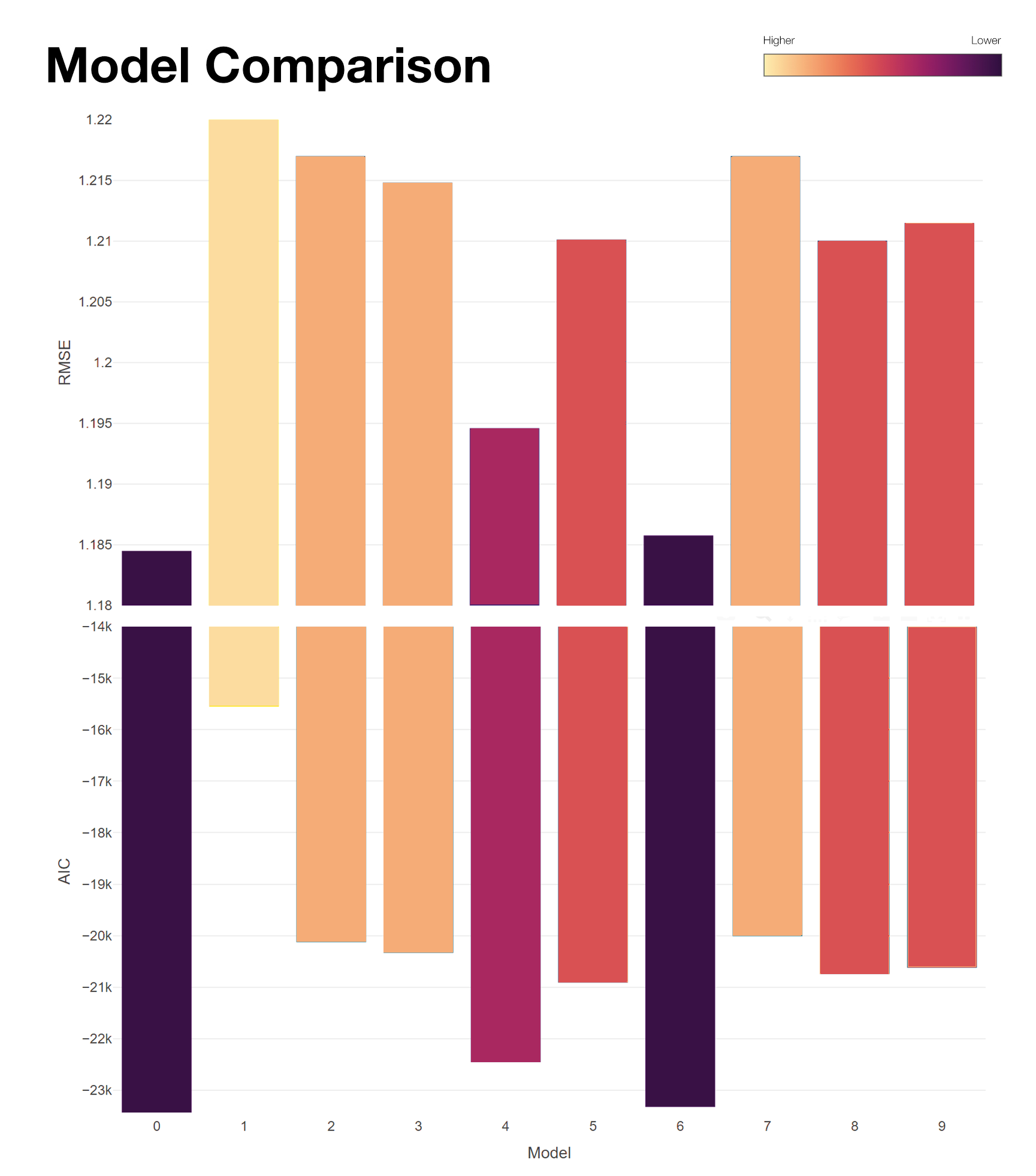
The table and grouped bar plot above present the evaluation for the performance of all 10 models (recall that we are looking for lower values for both AIC and RMSE, so the darker the column implies a better fit of the model). Overall, although none of the alternative models surpasses the benchmark model in both AIC and RMSE, the differences in RMSE is trivial if rounding to the nearest cent is applied with each model’s average error is around $1.21 on any given prediction. Moreover, the AIC is consistent with RMSE, and the model relative likelihood column full of zeroes further highlights the benchmark superior performance over the alternative models. As such, the only model that will be further investigated is the benchmark M0.
Effect of Duration
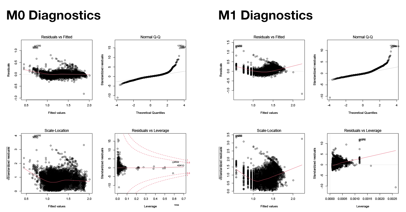
Figure 3. Standard diagnostics plot for M0 and M1
The baseline model M1, despite recording the worst RMSE, isolates and reveals how strongly Duration drives the final Total amount of a trip. Compared to M1, the predictive power of the best-performing model M0 only increases by approximately $0.1 at the cost of 46 extra terms in the model, implying that as expected, the single major driver for the fare amount is the duration of the trip. However, the standard diagnostic plots for M1 (Figure 3) see some noticeable trends in the error distribution of the predictions, which violate the assumptions of a Linear Model. While this does not rule out the linear relationship between the two variables, it shows that a linear fit on Duration tends to overestimate Total amount, especially for trips totaling under $10 and more than $30. Compared this to the diagnostic plots for M0, the additional terms and interactions show significant improvement in “linearising” the predictions.
Effect of Areas
Perhaps two of the most significant results from Table 2 is the performance increase from M1 to M2 as we added the Area terms, and from M2 to M4 as we changed the relationship from additive to interactive. The additive improvement supports the findings from the Feature Analysis, as the baseline costs (i.e., the intercepts) for trips beginning in one area are different from another. While Duration is highly correlated to Total amount, the inclusion of Area terms helps to differentiate between long duration – short distance trips (e.g., trips in traffic jams) and long duration – long distance trips, as we opted not to include Distance as a predictor due to multicollinearity. The different factor levels in PUArea and DOArea serve as a rough estimate of trip distance, which can explain why performance improves. A visualization of the additive effect, as well as its mixed model equivalence (M7), is demonstrated in Figure 4.
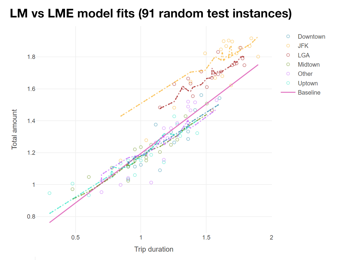
Figure 4. Model fits (the dotted lines are LMEs and dashed lines are LMs). Note that LMEs and LMs are the same here.
Meanwhile, the interactive model M4 is the second-best model notwithstanding M0, which further highlights the effects of different PUArea - DOArea combinations, rather than assuming that each area only individually affects Total amount. The intercept term for this model can be interpreted as a baseline distance, with 36 possible values, hence provides more information about the Total amount.
Effect of interactions between Duration and Areas
M5 provides information about how different Areas change the effect of Duration on Total amount. Not surprisingly, the interactive model M5 does not perform as well as M4, as the information about distance is not captured without the interaction between PUArea and DOArea.
Effect of TAT
Evidence from comparing M2 with M3 and M0 with M6 shows that the effect of TAT on Total amount is not as noticeable as other predictors, as it only increases predictive power by under $0.01. This is not surprising following the results from Phase 1, where it has been found that availability of public transport does not strongly influence the demand for taxi. Nonetheless, TAT remains a relevant predictor in the benchmark model with high significance (Table 4) and therefore will not be ruled out in the final model.
Random Effects
As mentioned in the Model section, LMEs can be thought of as a slightly improved version of LMs with more structured in its relationship. Therefore, it is expected that if the random effects are modelled correctly, the LMEs perform at least as well as its corresponding LM equivalents (i.e., treating the random effects as fixed effects) in terms of RMSE. Equivalent pairs in the current design are M2 – M7, M4 – M8, M3 – M9. The results show that for the current relationship, modelling Duration or TAT as random effects based on different Areas does not provide any significant improvement or even a different result (Figure 4) and thus interactive models are a better option. The result also implies that Duration and TAT does not seem to follow any specific distribution within each factor level of Areas, confirming good feature selection without any latent correlation.
2.5.3 Final Model Inference
The benchmark model M0 is trained on the full training set and evaluated on the full testing set. With a training result of \(R^2 = 0.8965\) and \(RSE = 10^{0.07249} = 1.18\), the final model does not vary much from the sampled model during evaluation, recording a \(RMSE = 1.183\). The stability of the results confirms the effectiveness of the sampling strategy used, as well as the validity of using the final model to infer the relationship between Total amount and the predictors. The reverse-transformed regression results are recorded in Table 5, which sheds light on the magnitude of the abovementioned effects from the various predictors. Using a fixed-variable cost model, with an increment of 10 minutes in trip duration, we can make simplified interpretation of the regression as: \[\text{Total amount} = \text{Fixed base rate} + \text{Variable rate} * \text{Duration}\] Note that since the interaction model implies a different base rate for each PUArea-DOArea combination, it does not make sense to analyse the coefficients in separation. For example, a LGA-bound trip from Midtown with a fixed base rate of $15.78 and variable rate of $2.19 does not necessarily net a higher total amount than a LGA-bound trip from Downtown with a fixed base rate of $14.36 as the latter has a higher variable rate of $2.26.
Table 5: Reverse-transformed regression results of the final model
Interpretations of fixed & variable rates
Overall, variable rates are higher for the non-hotspot areas as they cover a much wider number of zones than the other five areas (note that the variable rates can assume an analogous role of a standard deviation), whereas airport-related trips enjoy an expectedly higher base rate. Trips within Manhattan have a base rate of only around $4 to $5, and for every 10 minutes within this metro area, the taxi drivers can average between $2.5 to $3. Trips around the Uptown zones have a higher base rate than in Midtown and Downtown, while the variable rates are around $0.5 higher in the latter two areas. One explanation could be due to the higher traffic around the tourist attraction areas such as Time Square, Rockefeller (Midtown) and Soho, Tribeca (Downtown), which may incur higher travelling time. This finding also highlights the advantage of taxi drivers over Uber drivers when driving in Manhattan, as Uber fees are distance-based rather than duration-based, thus do not protect drivers from being disadvantaged in high traffic situation.
However, not all regression coefficients in the model are fully comprehensible. Particularly, base rate estimates for the JFK-JFK and LGA-JFK cases are unusually high, at more than $100 for trips that supposedly begin and end at the same area. A closer look at these trips in the training set reveals that the fare amount of these trips is indeed incredibly high despite the short distance, and hence potentially fraudulent or erroneous trip records in the data collection stage instead of model-related issues.
Interpretation of TAT effects
Since there is no interaction term for TAT, a regression coefficient of 1.01 means that taxi trips will cost $1 more for every 1 minute further away from the nearest subway station.
2.5.4 Error Analysis
Figure 5 summarises the distribution of reversed-transformed prediction errors for each PUArea – DOArea combination on the 199999 test instances. Trips picking up in Downtown and Midtown seems to have the most consistent predictions, while the airport trips have a much higher error range which seems to stem from the regression coefficient issues discussed earlier. The relative length of the whiskers also corresponds to the variable rates related to each combination, further cementing the validity of the coefficient inferences. While the results look approximately consistent across the areas, it is worth noticing that we did not extend the scope of error analysis to the outliers in the distribution, some of which are as extreme as $10 off the actual values.
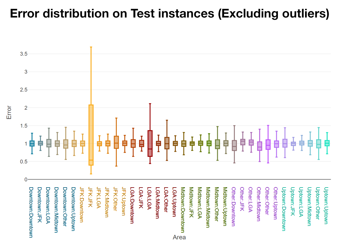
Figure 5. Error Analysis
Future work should allow for outlier analysis to reveal even more information about the more extreme trips in which the ordinary relationship between pick-up area, drop-off area, duration, TAT and total amount is not honoured due to special circumstances.